Color Theory
Categories: Uncategorized
A great article appeared on Yahoo today by David Pogue regarding the relationship of color. The article brings up a LOT of questions about the perceptions people have when relating to logos, products, etc.
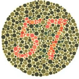
For example, the main image (shown above) highlights the most common colorblindness combination: red/green. This color combination makes the “57” in the center of the circle invisible to some folks while others see it clearly.
This same phenomenon happens with graphic design applications from logos to brochures. Some clearly see the intended image, message, brand while others are simply unaware that it exists or what is attempting to be communicated. This is where D57 comes into play. We help you to show your product; communicate your brand; know your message.
Work with us—we’ll make sure your message is clear and everyone sees it.
No comments yet.